The Montgomery...
While wandering around the west side of River North this weekend, a quaint and quiet area I haven't spent much time in, I was glad to stumble across "The Montgomery"
Completed in 1974 as the headquarters of Montgomery Ward, architect Minoru Yamasaki (known more for the design of the World Trade Center) has created a masterpiece in simplicity. Unusual is that there were no corner offices created. I also find it interesting that this building was completed at about the same time as their main competition, Sears, completed it's tower.
When the company collapsed a few years ago, developers rushed in to snap the building up for condo conversion. There was concern that a developer might try to tack on balconies or alter the building but that is not the case.
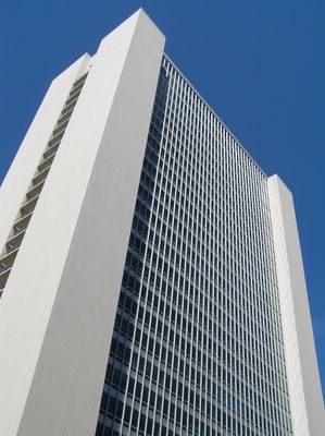
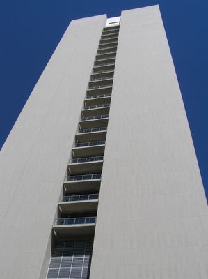
The condo conversion is nearly complete, and I feel they have done an excellent job with it. They incorporated balconies into the east and west ends, which almost look as though that was in the original plans.
The new circular parking ramp (not shown, pics didn't come out well), was incorporated very well into the NE corner...
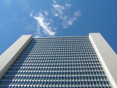
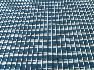
And the new windows are a fantastic choice, looking very modern, while at the same time retaining the original integrity of the structure.
Completed in 1974 as the headquarters of Montgomery Ward, architect Minoru Yamasaki (known more for the design of the World Trade Center) has created a masterpiece in simplicity. Unusual is that there were no corner offices created. I also find it interesting that this building was completed at about the same time as their main competition, Sears, completed it's tower.
When the company collapsed a few years ago, developers rushed in to snap the building up for condo conversion. There was concern that a developer might try to tack on balconies or alter the building but that is not the case.

The condo conversion is nearly complete, and I feel they have done an excellent job with it. They incorporated balconies into the east and west ends, which almost look as though that was in the original plans.

The new circular parking ramp (not shown, pics didn't come out well), was incorporated very well into the NE corner...

And the new windows are a fantastic choice, looking very modern, while at the same time retaining the original integrity of the structure.


1 Comments:
Love your archtectural photos. Keep up the good work. Maybe one day you publish a book of Chicago architecture.
Post a Comment
<< Home