Koolhaas at IIT...
This past Saturday, Michael and I took the Architecture Foundation's "Mies and Modernism: The IIT Campus Tour" and aside from being in complete overwhelm with all of the Mies buildings, I was equally blown away by Rem Koolhaas' design for the McCormick Tribune Campus Center. The center is so completely different from very Miesian surroundings, yet the relationship is very clear. I had seen the building from a car driving down State Street, but this was the first time I was able to walk inside and take it in. All I can say is Wow!
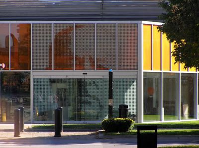
The entrance on State Street uses tiny icons of varying shapes to create the image of Mies Van Der Rohe. This was Koolhaas' ode to his modernist forefather.
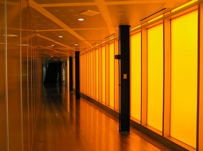
Inside the front entrance is this hallway leading off on a angle. There are several passageways on various angles which represent the pattern created by students walking through the grass before the structure was built.
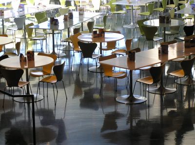
Looking down into the dining area. Jacobsen's Series 7 Chairs (1955) still look so current.
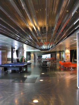
Looking south through the center of the building. The steel structure above is the underside of the tube which wraps around the CTA's Green Line.
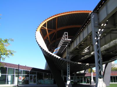
Outside, you can see how the building appears crushed by the tube structure wrapping the "L" tracks.
The entrance on State Street uses tiny icons of varying shapes to create the image of Mies Van Der Rohe. This was Koolhaas' ode to his modernist forefather.

Inside the front entrance is this hallway leading off on a angle. There are several passageways on various angles which represent the pattern created by students walking through the grass before the structure was built.

Looking down into the dining area. Jacobsen's Series 7 Chairs (1955) still look so current.

Looking south through the center of the building. The steel structure above is the underside of the tube which wraps around the CTA's Green Line.

Outside, you can see how the building appears crushed by the tube structure wrapping the "L" tracks.


3 Comments:
Nice pics, though it looks a bit empty, probably due to it being a Saturday. I was there for the opening when the place was abuzz. Unlike a Mies building, which almost craves being empty, the student center wants lots of activity. Otherwise it's like a ghost town, desolate but with traces of its use.
Thanks John,
It was pretty desolate being that it was Saturday, but I shot the images without people purly to focus on the design of the space. I agree that the space calls out for people, whereas Mies tends to look best when empty.
Gotcha. Most of my pictures tend to have an absence of people, at the consternation of my parents and friends.
Post a Comment
<< Home