State Street Village...
In continuation from yesterday of our tour of IIT this past Saturday, we got to see up close the Helmut Jahn designed, new student housing at IIT. Completed in 2003, this was Jahn's first project in Chicago in quite a long time.
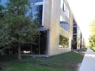
The view standing at the corner of State and 33rd looking south.
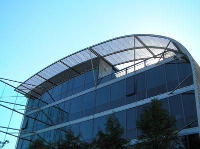
Looking up from the same spot. Jahn's newer designs are an improvement over his work in the 80s. I see similarities to the Shure Headquarters building in Niles.
The top floor of each building has an outdoor terrace for the students with great views of the downtown skyline and Crown Hall across the street.
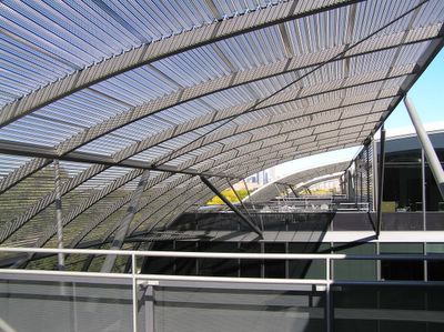
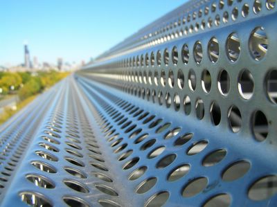
Downtown skyline looking along the sun shades between each terrace.
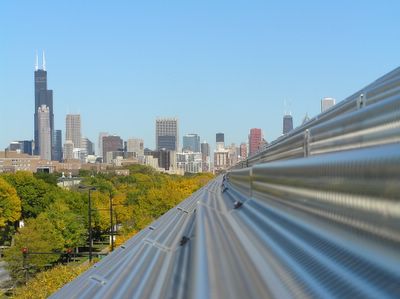
Same shot focusing on the sun shade itself.
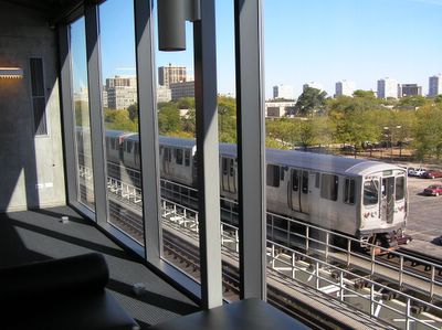
The student housing faces the Green Line, our tour guide told us that the double pane windows use two different thicknesses of glass to minimize the sound transmission of the train.
The view standing at the corner of State and 33rd looking south.

Looking up from the same spot. Jahn's newer designs are an improvement over his work in the 80s. I see similarities to the Shure Headquarters building in Niles.

The top floor of each building has an outdoor terrace for the students with great views of the downtown skyline and Crown Hall across the street.

Downtown skyline looking along the sun shades between each terrace.

Same shot focusing on the sun shade itself.

The student housing faces the Green Line, our tour guide told us that the double pane windows use two different thicknesses of glass to minimize the sound transmission of the train.


1 Comments:
The Koolhaas and Jahn buildings at IIT are a great lesson in different design approaches, the former opting to create a focal object to deal with the noise, while the latter accentuates his design (with increased glass and insulation) to do the same. They both seem to work well in achieving the goal of dampening the sound of the LOUD trains, so it kinda shows that we have room for both kinds of approaches, among many.
Unfortunately, I have to side with Koolhaas over Jahn here, because of Jahn's misguided preference for transparency as THE aesthetic for buildings. When I walked along the east wall of the dorms, dead birds littered the path. It was sad. And why? For aesthetic ends. I think that designers will move away (and many are) from pristine glass containers to layered skins that not only deter birds but also provide more energy efficiency and aesthetic choices for the designer and the people that have to live with the buildings.
Post a Comment
<< Home